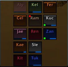
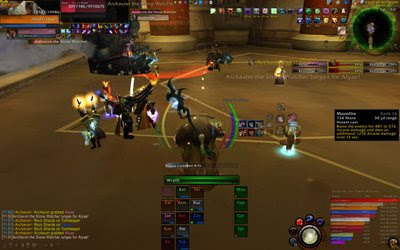
Above is generally how I have my Grid frames laid out. It was a 13-man raid, with four pets to the far right. Colored icons in the corners tell me other information that I specified: hots, buffs, aggro, incoming heals, etc. When someone is out of range, they fade out to a lower opacity (such as Alyae). My lifebloom timers will show up as numbers below each person's name.
To open your configuration panel, type /grid config
There are 3 major menus:
- Frame controls what each individual health bar looks like and what additional info is shown.
- Layout controls how the groups are organized on your screen.
- Status controls all of the available buffs, debuffs, timers, etc and how that information is colored, prioritized, and timed.
FRAME
is the first section of settings. This is where you determine exactly what will be showing on each of your health bar boxes, and how it will show it.
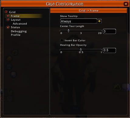
- Center Text Length:
the number of letters that will show of the unit's name. I have it set to 3, so I show as "Kae" and Alyae shows as "Aly." - Invert Bar Color:
unchecked, this makes the health bars show up dark, with a bright class-colored background that will show when the unit has taken damage (this is my preference). Checked, it will make the health bar bright and class-colored, with a dark background. I prefer to leave this unchecked because I find it easier to notice bright chunks of the background when health is missing, than to notice dark background of the missing chunks when all the health bars are brightly colored. - Healing Bar Opacity:
Grid supports showing estimated incoming heal amounts on the health bars. This opacity setting, where 0 is not showing and 1 is completely opaque, applies only to heals that are being cast at the unit, but have not landed yet. It is an estimation that does not account for crits, but is an excellent tool for avoiding too much overhealing and helps healers in a raid better coordinate with each other.
FRAME: ADVANCED
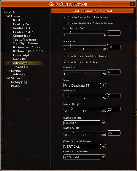
When you open up the frame submenu, you will see options for each of the different elements of the unit frames. Each part has its own menu where you can check next to the information you want that element to show you. For example, I have the "Center Icon" element with the boxes checked for the Debuff types that I can cleanse AND the Ready Check (appears as a check, question mark, or x in the middle of the box for each person during ready checks). These elements are where most of your customization will occur.
One of the underdog indicator elements that many will overlook is the "Border" element. This element is absolutely awesome for showing you who exactly caught your AoE buff: specifically, things like Wild Growth or Circle of Healing. If you don't have/need an AoE to monitor, they can be used to indicate people who have been shielded, and how long that shield will last, and when it breaks; or Prayer of Mending and its duration. Or, you could make it an aggro notice, so the whole frame border lights up red when they've got aggro on a mob.
One thing to keep in mind is that you can have each element display multiple things. The more important one will be displayed over the others, if multiple statuses are true: such as the person having aggro making the border red rather than the blue of the same person being OoM. The importance levels can be set later in the "Status" menus, as their "Priority." Using the Priorities, I like to have buffs show one color if it is my own HoT, and another color if it was cast by someone else. The Status menu will be discussed later in this post.
Towards the bottom of the Frame list is another submenu called "Advanced."
- Center Text 2 Indicator:
This adds another row of text to each bar, below where the person's name is located by default. This is the best place to stick an important timer (in my case, lifeblooms). Not every class has need of this extra text, but it is very useful. Once checked, the Center Text 2 will show up with the rest of the elements, and you can click it to specify what information you want it to show. - Health Bar Color Indicator:
This will allow you to make the health bars change color depending on a status you can later define. For example, you may choose to make the health bar change colors as the person gets lower on health, or you may instead wish the color to change depending on a curse, poison, disease, or magic debuff. I personally do not use this indicator, preferring instead to allow the bars to remain a single dark color based on the person's class. - Icon Size:
This is an icon that appears in the center of the frame, and is usually something important that you want to see fast: like I mentioned above, I use this for debuffs that I can cleanse, as well as any missing buffs that I can cast when I am out of combat. - Corner Size:
These are small colored boxes in each of the 4 corners of each unit frame. - Frame width and height:
Controls the shape and size of your health bars. I like using a rough square shape, though if you prefer elongated "standard" style health bars, you can make the width longer. - Orientation of Frame:
Vertical is one of the more unique aspects of grid: health drops down from the top, rather than from right to left. If you prefer the "standard" style where health moves like it does in the standard blizzard UI, you can change this to horizontal.
LAYOUT
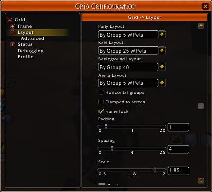
The layout controls how all of the individual health bar frames are organized.
- Horizontal Groups:
unchecked, each party in a raid will appear in standard blizzard UI style, in a vertical line of health frames. If checked, each party will line its members up next to each other horizontally. - Clamped to Screen:
Makes the whole group "sticky" where they will try to lock themselves to the edges of your screen, to assist in positioning the frames. - Frame Lock:
uncheck this to move the group around your screen. Check when you are done positioning it so that you don't accidentally move it mid-combat! - Padding, Spacing, and Scale:
Controls how far each person's box is from all the others, and how big they are. - Colors:
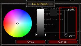
You can have a background underneath ALL of the frames, putting them together in a large box. Border color and background color are determined by clicking on these color boxes and choosing your color. Alternatively, if you do not want an overall background and border, click on these and move the right-hand side opacity slider all the way down to the bottom, making them fully transparent and unseen.
STATUS
This final menu controls exactly how information is handled overall: these are the things that are available for to add to your frames, and this section controls their individual aspects. Auras are buffs and debuffs, and this is where you can add new ones and personalize them before adding them to the frames. This is where you can change how frequently grid will check for statuses, and what priority the status will have over another if they are both set to show in the same frame element (ie one buff over another, or your own HoTs having priority to show overtop of one cast by someone else). This is where you can determine what colors things will show up as, and when; for example, a heal-over-time or power word shield can be told to show as light blue first, then change to yellow when they have 3 seconds left, then red when there is 1 second left on its duration. You can change the class colors, if you want!
Make sure that if you want to make any additional statuses available and working on your bars beyond the default, that you have a check next to "Enable" on that status' menu.
BEYOND DEFAULTS
Grid has lots of external modules that you can download to add extra statuses (such as lifebloom, ready check, and raid icons), layouts (pre-arranged for specific raid sizes or zones), and frame indicators (extra places to show icons or corner boxes).
Do find these, search your preferred mod sites for Grid, and you will see lots of additional modules. Most are written by other users rather than Grid's core author, and as such, there are some that do basically the same thing, and some are better than others for their job or the number of options they provide.
My best recommendation is that you read through what is available and try out the ones you think you would like to use: many are class specific, some are healer-oriented, others are for raid leaders (such as Ready Check). There are a lot of them, so take a look through what is available and pick out what you need.
The extras that I personally use:
- GridManaBars
- GridStatusLifebloom
- GridStatusHots
- GridStatusRes
- GridStatusRaidIcons
- GridStatusAFK
- GridStatusReadyCheck
- GridStatusMissingBuffs
- GridLayoutPlus
- GridAutoFrameSize
- GridIndicatorCornerIcons


 Resto
Resto Balance
 Feral
Feral


2 comments:
Need help with grid. Everytime I DC or relog my grid settings reset to default?! I'm comfortable with with the setup (I have used grid for over a year and setup manually everytime).
Sorry if the answer is in the tutorial, but, after a year of beating my head against the wall and countless reads I'm willing to surrender my ego and ask for help :)
Thanks in advance! Looking forward to logging on and not having to go the the settings everytime.
If your profiles aren't saving, I'd recommend asking on the wowace forums for support on that end.
Otherwise, only advice I can really give is to clear out your wtf folder and start fresh, making sure you save the profile when you have Grid set up how you like it. :(
Post a Comment